Paint My…Living Room! The Quarterly Color Series with Backdrop
Driven to make changes with the new year? Many of us feel that pull in January, and we may be looking around our home to see what areas could use a refresh. Besides moving furniture or buying new pieces, there’s one surefire way to transform your abode with minimal hassle: fresh coats of paint. Interior design experts will tell you that a new paint color goes a long way. This year, The Related Life has teamed with Backdrop, a leader in sustainable paint, for a quarterly series focused on the latest and greatest in color trends for the home. First up? The living room, a focal point of any abode.
“Paint is such a powerful way to transform a space – regardless of the size of your space, you’ll want to consider the atmosphere you’d like to create,” explains Natalie Ebel, co-founder of Backdrop. That’s especially true in the living room, where you both relax and entertain.
Purpose-driven Paint
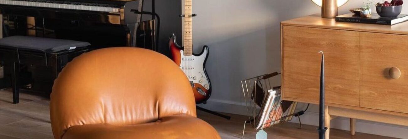
Cool neutrals tend to have a calming effect. If that’s the vibe you’re after, consider MOONSTONE, an off-white with gray, or COOL MOON, a cool, bright white. However, if you plan to do more entertaining in the coming year and want to create an inviting atmosphere, warmer colors are the way to go. Two on-trend options are MOONLIGHT, a warm off-white, and MODERN LOVE, a warm, muted pink.
The paint color "MODERNLOVE" provides trendy contrast here. Credit: Backdrop
Most important of all in picking a color is trusting yourself. “Don’t let the size of the room intimidate you. Just think about the environment you want to create, your personal style, and you can’t go wrong,” notes Natalie.
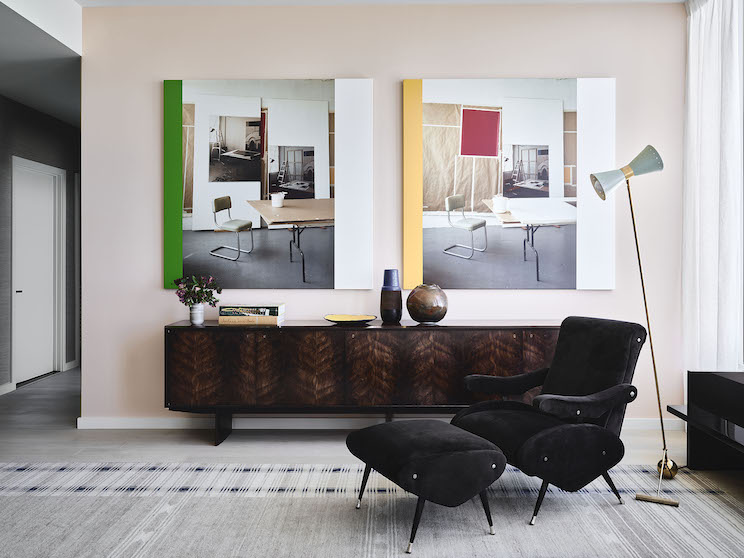
"If that means painting your walls black, AFTER HOURS, a soft, charcoal black, is perfect; if you’re feeling a soft, smooth pink, ROSE QUARTZ, a warm pink with gray, is great,” she says.
The paint color ROSEQUARTZ gives an air of warmth and understated elegance to this living room. Credit: Backdrop
New Color Palettes
For help making those (sometimes tough) paint decisions, Backdrop has developed highly edited palettes, with the aim of helping residents to abate decision-paralysis and have more confidence in the use of colors. Their online gallery showcases real people in real spaces with real paint.
And in speaking to this year’s top interior design trends, the team at Backdrop just released three new colors that are “atmospheric and fresh, and would all look great in a living room,” says Natalie. Check them out below:
-
- GIN BLOSSOMS, a warm lilac, is both calming and inviting - great for whether you’re hosting guests or home alone.
- SILVER LAKE DAD, a slate-blue gray is cool and accomplished, and delivers that air to any space.
- EARTHLY DELIGHTS, a light peach, is really refreshing. A great way to liven up a living room.
Timeless Classics
However, if you prefer your living room have a more traditional, timeless look, stick to neutrals.
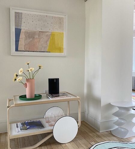
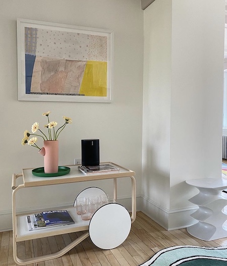
A functional corner painted in HARVESTMOON. Credit: Backdrop
“Warmer neutrals like HARVEST MOON, a warm white, PALO SANTO, an earthy yellow-beige, and MOJAVE GATHERING, a neutral gray-beige, all create a cozy, inviting feeling, which never gets old,” says Natalie.
“If you have a more open floor plan or your living room connects to other spaces, choosing a pure white, like SUPERMOON, is a timeless way to service a seamless transition,” she adds.
With such a wide range of swatches, we might have given you a lot to think about, but we hope this roundup has proven helpful if you’re interested in restyling your living room! Natalie tells us that Backdrop has a handful of new colors in the pipeline for 2022.
For new releases and more color inspiration, you can always follow them @backdrop on Instagram.
The Related Life is written and produced by the Related Life Editorial Team. Be sure to follow us on Facebook and Instagram for the latest events, news and announcements in your area, and tag us for a chance to be featured @therelatedlife and #therelatedlife.